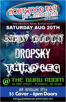
Music Fliers
From June 2009 to August 2011, I was part-owner of a local music promotions company. We produced promotional material for each show and asked the bands to attract their fans by posting fliers on Facebook, MySpace, ReverbNation, etc. Our graphic designer resigned January 2011 and I offered to take on the job. Here is some of my best work with brief descriptions of the design rationale, challenges, and inspiration. Also included are fliers created for my son, DJ EZ, and his rock band TooBoKou.
The band had this background image on facebook but it was so small it had to be drastically blown up to a useable size.

Playing upon the Traverser name, this image was selected to portray traversing through an outer space colony.

A band member had produced a similar flier that wouldn't adapt to our format so the theme was recreated.

Here again, the band made a flier that was not conducive to our specs so the water theme was reproduced.

There's just something about the angles of this background image that seems so uplifting and appealing.

All of these bands play softer rock so the selection of an acoustic guitar background seemed appropriate.

The first band used the image as an album cover. The text area was enlarged and blended to fit all band names.

This first version of the show's flier matched the album cover font and included a slick guitar background.

The final flier version for this show took shape after David's wife provided a great photo of her husband.
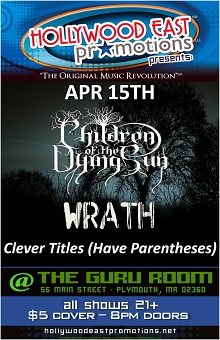
The background image of trees was nearly the perfect match to this hardcore metal headliner's logo design.

The only thing this great image needed was a transparency adjustment to keep the names in the foreground.

Font matching was used to add "CD Release" and the red McSwagger logo was converted to a transparent gif image.

This punk rock show needed a cold, concrete look to complement the hard-edged, stripped-down music style.

One of these bands traveled with their own amazing light show so the flier needed to be very colorful.

What better background to use of earth's only satellite for a band going by the name of One Lonely Satellite?
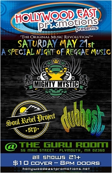
Logos positioned on a burnt wood texture. The colorful "Special Night of Reggae" was added later at band's request.

This dark image of a long border fence was chosen because of the headliner's name: Borderline Blackout.

Color matching and image conversion to transparencies for the first two logos were the main focus here.

Bonesfest (the birthday party for an associate named Bones) needed a skeleton with headphones and a bone font.

Everything here is either blue or white. Except, of course, for the black contrast in the "stained glass" background.
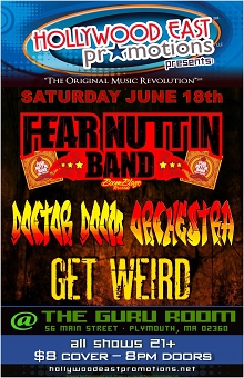
The background is the same image used for the April 9 flier with color adjusted to match the predominant red tones.

Each of the logos had a unique style making coordination difficult. The background pulls it all together fairly well.

The flier as a whole centered on a reddish tone while the grunge background worked nicely with the headliner's logo.

A country music show, the design intent was to look like an old "wanted" poster via the image and (lack of) color.

The lines of this background image worked quite well with the diagonal cuts of the band's "Ratfynkt" logo.

The rabbit and stick figure aspects of the logos combine with the selected background to create a very surreal feeling.

The band provided the logo and center image leaving me to add the spiral background and coordinate the colors.
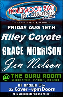
Two band names are fonts while the third is from the musician's website and was made into a transparency.

The background and headliner's logo are the work of our former graphic designer. I made it look good on a flier.
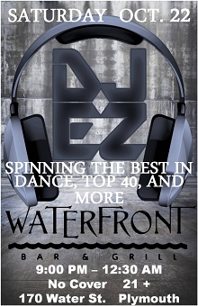
The same logo and headphones as July 15 and the same background as May 6 but with different color tones.

The smokey green background is a subtle play on the date being 4/20. You know, international marijuana day.

The fifth band member quit after the new CD cover photo was shot so the challenge was photoshopping him out.


